Beyond Tellerrand
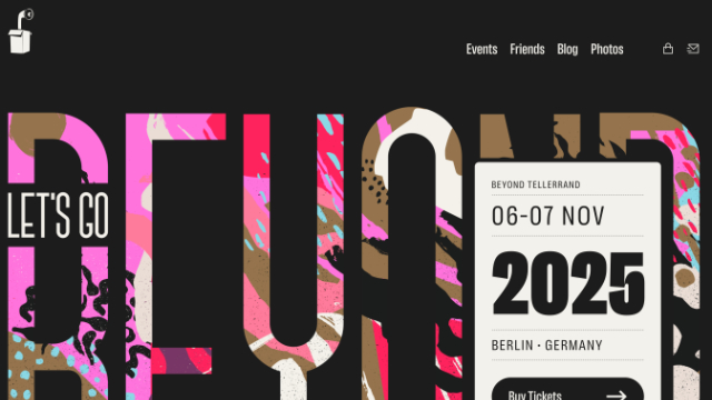
The latest refresh of the Beyond Tellerrand conference website introduces a fresh presentation style, with accessibility clearly taken into account. Focus states are bold and easy to see. Colour contrast is strong and consistently applied across all elements. The structure is well considered, with logical use of landmarks and a clear heading hierarchy.
There are still areas for improvement. The photo gallery is a weak spot, as many images are only described with the photographer’s details. They lack meaningful descriptions of the actual content.
- Previous: Review of hiddedevries.nl
- Next: Review of Matthias Ott