Matthias Ott
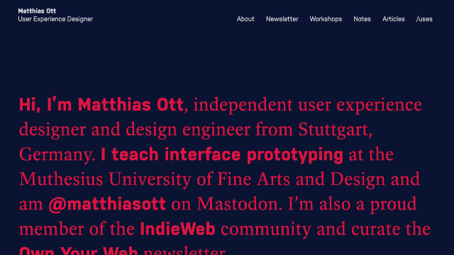
Matthias Ott has relaunched his website with a thoughtfully structured and highly accessible design. It features crisp typography, modern CSS techniques, and a consistently applied colour palette that accommodates users with a broad range of vision impairments.
While the overall experience is strong, there’s room for improvement: the Kontrastor overlay could be easier to dismiss, and have more distinct labels for its controls for screen reader users. Keyboard-only users would benefit from more direct access to the primary navigation, either through an additional skip link or changing the focus order.
- Previous: Review of Beyond Tellerrand
- Next: Review of Modern CSS Solutions